Zelda Dungeon Talks: What Is Your Preferred Zelda “Art Style”?
Posted on October 20 2015 by Josh Tasaico
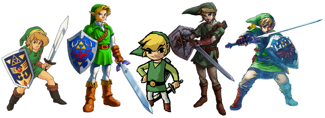 Hi all, and welcome to the week’s edition of Zelda Dungeon Talks! Throughout The Legend of Zelda series there have been many different art styles used be developers to portray Link and Hyrule (or other lands). People often seem to recognize the art style of The Wind Waker and Twilight Princess and I don’t blame them. Wind Waker has an art style that really stands out due to it’s cartoonish look. Twilight Princess is the most realistic looking Zelda to date. These are just a couple of examples now it’s your turn to decide which is your favourite.
In this week’s edition of Zelda Dungeon Talks various staff members will tell s which Zelda art style is their favourite and why.
Jon Lett – View Profile
I am a bit biased, as The Wind Waker is my favorite game, but it’s art style always had a place in my heart. It’s sort of “painted” look was always very cool, and had a lot of potential for looking even better, if released in HD. Now, the only real fault I can see about The Wind Waker HD is that while it did make the game look fantastic with all the smoothing out and shading that the graphic artists did, I think I would have preferred it if they decided to simply expand on the art style that was already there, rather than smooth it out. The first thing that comes to mind is what Okami did with it’s art style. it is very much like The Wind Waker’s, but they went wild with the whole “painted graphics” thing. Either way, The Wind Waker’s cartoony, artsy look is still my favorite.
Thomas Jacobs – View Profile
My personal favorite would be the realistic style of Twilight Princess, which is continued in Zelda Wii U. The sprite-based style of the earliest games and the pseudo-3D style where everyone’s leaning like they’re in the Hylian version of Smooth Criminal works for the limitations of the platform, but for a true 3D experience I would prefer the realism that TP set up. It allows to portray a world that feels real while still retaining the ability to add in the more fantastical and bizarre elements, and serves as a beautiful contrast with the half-cartoony style of Ocarina of Time and Majora’s Mask (a style also used by Final Fantasy VII, who later went for the more realistic approach of Final Fantasy VIII), the cell-shaded Wind Waker and friends and the “softer” approach of Skyward Sword. Despite being almost 9 years old as of writing Twilight Princess still holds up rather well, but the graphical boundaries have been pushed so far since the GameCube. Zelda Wii U looks incredible and I would love to see what else the game can show with the power of the Wii U.
Jarrod Hadrian – View Profile
Out of all of the games art styles Twilight Princesses is my favorite, I believe that the art style matches the gameplay very well. It set the tone for the game and I feel that it helped to make the Twilight Realm be both dark and saddening. It fit the game well and all of this talk of a HD Twilight Princess gets me excited because I feel that the graphics of the title need to be redone to make it display clearly. I really hope that a HD version of Twilight Princess gets made because the Wii version was quite blurry and the controls didn’t work very well at times, but Twilight Princess HD would be using the GamePad and it wouldn’t be blurry so I feel that it would work well. I feel that art style can affect game quality, for me if the gameplay and graphics go together well I personally enjoy it more and find it more believable. Twilight does a fantastic job of the art style and I feel that it matches the events in the game perfectly. It makes the game more serious and allows for the games events to be enhanced as it sets a tone.
Brandon Schmitz – View Profile
One of my favorite aspects of the Zelda series is its willingness to take risks with various art styles. Just about each 3D entry, especially, uses an art style that feels contingent on the themes of the story. Although I love what each core title brings to the table, Twilight Princess’s aesthetic resonates with me the strongest. Its art style is dark just enough to match the game’s level of melancholy, yet — like Twilight Princess as a whole — not so drab or dreary that it feels as if it’s part of a different game series. With its fair share of whimsical — and occasionally downright weird — moments, the game still feels distinctly Zelda. The visuals aren’t as inherently ageless as Wind Waker’s — and could definitely benefit from, say, an HD remake — but they still manage to evoke the same feeling that they did back in 2006.
Josh Tasaico – View Profile
here are many different art styles that have been used in the many Zelda games and they are all great in their own way but the one that stands out for me is the art style used in Skyward Sword. Skyward Sword essentially combines a realistic Link and a more cartoonish Link. This semi-realistic art style makes Skyward Sword look great and it almost looks like a painting come to life. The vibrant colours make sure that the game never gets too depressing without looking like what some people might call childish.
