The Wind Waker HD gets updated item menu
Posted on August 11 2013 by Parker
 Less than two months from now Japanese and European Zelda fans will be able to enjoy The Wind Waker HD in the comfort of their homes. With an official North American release date yet to be announced, Nintendo has continued to wet our appetite for high-seas Zelda adventure with new screenshots teasing the game’s visuals and features. The latest of these shows off an important component of any Zelda game: a new and improved item menu.
Hit the jump for more!
New screenshots of The Wind Waker HD naturally don’t pack the punch that sneak peaks of a brand new Zelda game would. Being a remake means we already mostly know what the game has to offer. Still, it’s always fun to see how a classic game has been updated for modern times. We’ve already seen HD face-lifts for many of The Wind Waker’s iconic locations and characters. Now we finally have a close-up look at how the game’s item menu has been altered for Wii U.
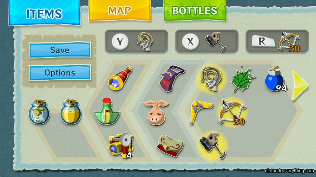
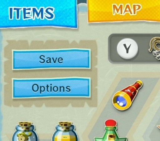
Menus don’t usually entice much excitement from the average gamer. Certainly, they perform important functions in games, giving access to items, abilities, stats, settings and more. Compared to the wow factor of gameplay footage, however, their importance doesn’t receive much recognition. Zelda games, however, have always treated even its most basic interface features with an artistic lens. This can be seen in the screenshot above. The new menu’s overall design is sleek and attractive. In terms of functionality, it’s clearly been optimized with the Wii U GamePad in mind. Comparing it with the same menu in the GameCube original, the subtle improvements are apparent.
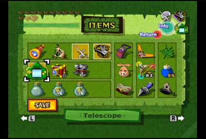
The first alteration that catches the eye is the change in color. The various shades of green filling in the background and inserts have been painted over with light blues, pale grays, and light browns. Overall, the new look is less gaudy and flamboyant due to the softer and more muted colors, which gives the menu a contemporary look. What the design does keep from the original is the subtle, “paper with shredded edges’ backdrop.
Though the item icons in the remake aren’t identical to the old ones, they are largely similar in appearance. What has been changed is the arrangement of the items on the screen. In the GameCube menu the icons are organised in rectangular columns and rows. On Wii U these have been exchanged for polygonal shapes with additional angles. The new structure is visually interesting, at least compared to the original blocky table. Items that have been equipped are still highlighted with a yellow background, but as can be expected, the inserted mini-map of the GameCube face buttons has been removed.
Nintendo seems to have taken advantage of the touchscreen navigation of the GamePad to streamline The Wind Waker‘s menu interface. Along with a user friendly and attractive layout, the screen apparently provides easy access to the game’s other menus. Additional shortcuts to the Map and Bottles menus will allow players to quickly switch between them and the Items screen. Players can also save their game and access options on the fly.
Overall, I’d say the overhauled menu for The Wind Waker HD has a lot going for it. Exceptional presentation and a clear focus on functional accessibility combine to create an attractive system. Even though I’ll always hold a certain fond nostalgia for the original green-tinted menu, I have to give props to the Wii U version for being the superior design.
Are you happy with the redesign of The Wind Waker‘s item screen? What else would you like Nintendo to reveal in screenshots before the game launches? Are you excited to play this most recent Zelda remake from Nintendo? Let us know in the comments below.
Source: Nintendo Everything
