Daily Debate: Which Zelda Game Has Your Favorite Art Style?
Posted on September 01 2021 by Joseph Berlinger
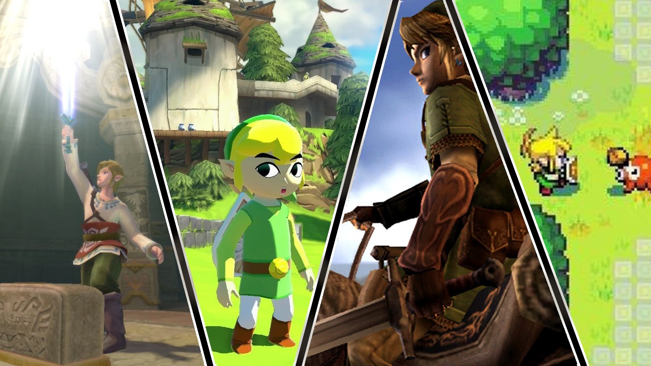
Now that Skyward Sword HD has hit the store shelves, newcomers to the series will get a chance to play a Zelda game with a rather unique art style. Skyward Sword took the cartoonish color palette of its ancestor The Wind Waker and merged it with the more realistically proportioned model designs of its immediate predecessor on the Wii, Twilight Princess. The end result was an oil-painting aesthetic that reminds me heavily of Tigger’s Honey Hunt back on the Nintendo 64. This storybook design choice complimented the narrative decision to serve as a distant prequel to the Zelda series.
What is your opinion on the various Zelda art-styles? Which of them is your favorite? After all, the color-palette, character designs, lighting, and shading all play a part establishing a tone for the game’s story to wrap around. Personally, my favorite art style is Breath of the Wild. That game managed to combine several elements from the previous 3D Zelda games to create a visually pleasing world. The characters, though Mii based, are wholesome and the reimagined Rito design is spot on. Lighting in this game is a big step up from the bloom experiments in The Wind Waker HD. The way the light wraps around the grassy planes at sunrise in Central Hyrule, or how it gently lights up the ocean at Lurellin Village is something I had never seen in a game before. Though none of these effects compare to the various skybox designs for the game. The most visually stunning moment for me was the way the sky turns full apocalyptic the moment you reach Ganon’s Sanctum.
Which Zelda game has your favorite art-style? Let us know why you like it in the comments below!
