Daily Debate: What Were Your Initial Feelings About The Wind Waker’s Art Style?
Posted on August 21 2023 by Judy Calder
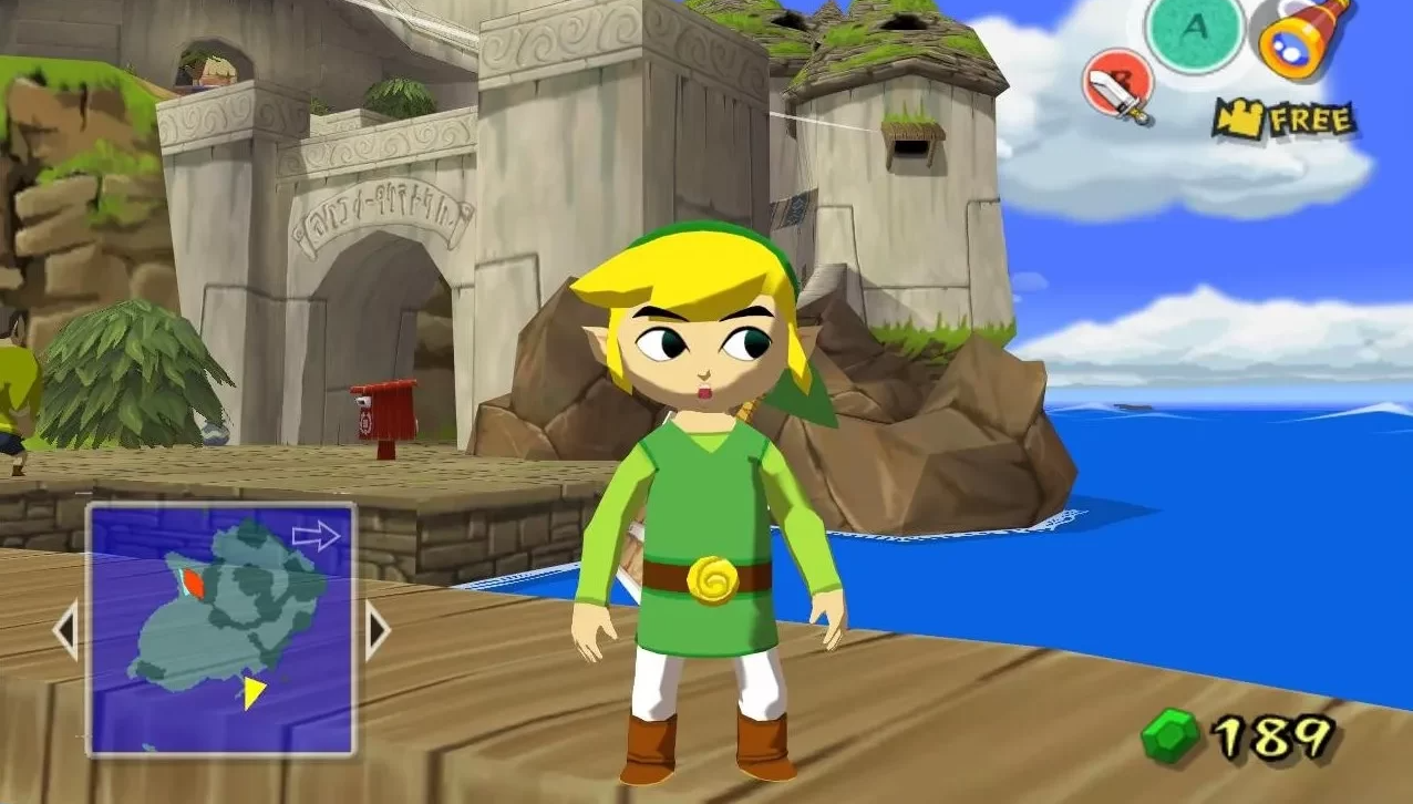
The Wind Waker released outside of Japan in 2003 to the excitement of Zelda fans everywhere. I’d heard about the new game, but my internet access wasn’t anything to brag about, so I’d never actually seen how it would look. By the time I managed to snag a copy and check out the box art, I knew this wouldn’t be like any Zelda game I’d seen before! Was I a little disappointed? The honest answer is: yes.
Way back then, I was very much set in my ways. I liked my Zelda games Ocarina of Time and Majora’s Mask-style, and anything else was just insulting. I remember wondering what Nintendo were playing at, making Link’s head so huge and with such goofy eyebrows too! The color pallet was all wrong, the enemy designs were not up my street, and that boy with the runny nose — eugh!
Art style aside, I pushed through the disappointment and found that The Wind Waker was a pretty cool game. I determined that it didn’t hold a candle to my beloved Ocarina of Time though, and I didn’t touch it again for a good few years. When I eventually came back to this title, I had matured, and had several more Zelda games under my belt. My taste must have developed because of this, and I found some appreciation for The Wind Waker’s art style on my second playthrough. Now, Toon Link felt whimsical, and the color pallet seemed to fit more appropriately. Ganondorf’s design was certainly less offensive too. I found myself thinking that The Wind Waker was more than just a pretty cool game — it was definitely in my top five Zelda games at that time!
What were your initial feelings about The Wind Waker‘s art style? Were you as disappointed as me, or were you excited about the new direction? Let us know in the comments below!

Judy Ann Calder is the Managing Editor at Zelda Dungeon. She joined the ranks back in 2018, bringing some good old British charm to the table.
Contact: judy.calder@zeldadungeon.net
