• Welcome to ZD Forums! You must create an account and log in to see and participate in the Shoutbox chat on this main index page.

The Lack of Detail in SS, Due to Impressionism

Joined
Oct 2, 2010
Location
Faron Woods
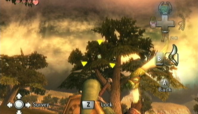
Not so long I saw a video in Youtube. In the comment section there was a discussion about impressionism. The editor of the video firmly supports the new art style. I like it aswell, but I think the game lacks far too many detail in some areas. More specifically; there are few effects in the environment, some textures look blurry, some areas look bland, the trees foliage just looks plain and flat, there´s a general lack of detail in the environment. Even WW, that is a Gamecube game and fully cel-shaded, has a more attention to detail. TP also has much more attention to detail, you´ll see birds flying or walking around in the forest, particles and light effects, the trees look actually real and even some enemies are better animated. Not everything is bad and some areas in SS are truly impressive.

This person argues that this lack of detail is due to the artstyle and goes along with the impressionistic look the game tries to achieve. Apparently, form what he says, the graphics in SS are finished and that what we saw in the presentation is the final design and look of the games graphic quality.

the-legend-of-zelda-skyward-sword-20100615103805125_640w.jpg

Most of the game's vegetation looks flat


Impressionism is an interesting style, but after watching some impressionistic artwork, I have too say that if SS is trying to fully replicate this artstyle, then it still has some work to do. The truth is that the game would look horrible if it were to emulate impressionism at its fullest. The graphics would be very blurry and it would be hard to distinguish objects and enemies clearly in the environment. From what I've read, the developers are trying to create an impressionistic effect on the background mostly. I don't mind this new artstyle, but I disagree that the game has too look bland in order to replicate it. SS is not the first game that is based on a drawing or painting artstyle. WW itself was cel-shaded and had a lot of attention to detail. The environments look incredible, filled with particles effects, crisp textures and good lighting effects.

windwaker-r-1.jpg

WW is filled with a lot of detail, despite cel-shading been inclined to a more simplistic design

the-legend-of-zelda-skyward-sword-20100930045934072.jpg

Some areas fare much better and look impressive

Okami is another game which its artstyle is based on a painting artstyle. Its a Japanese style called "sumi-e", also known as Ink and wash painting, a trademark Japanese drawing style. This style lacks the detail that other drawing techniques boast, it looks very similar to a Watercolour painting. Yet, Okami took its own liberties and added a lot of colour and detail to the game. (The Wii version is actually much more colourful than the PS2 version.) Most areas in the game look incredible, the colours slightly diffuse to keep the Watercolour effect, but you will find a lot of detail in the textures and the overall layouts of the game.

okami-20080318112509219_640w.jpg

Most areas in Okami are crammed with detail creating a beautiful and living world

It is true that this artstyles requires less realistic detail in the environment, in contrast to a more realistic aspect such as the one found in TP; but that doesn't mean SS cannot have much more detail in its graphics. It is true that its looking for an impressionistic look, but for the sake of keeping the same attention to detail other Zelda games have, SS should take its liberties and add more detail to the environment. Flat looking trees and bland areas are not going to do any good to the series. Now, I know that what we saw was just a Demo, and I'm pretty sure that Eiji Aounuma and his team will deliver us an excellent product. But what that person was saying made me think. Do you think that SS will loose much of its detail because of the new artstyle or the developers will improve the presentation to the game to deliver us a beautiful game such as other first-party title of the console have done?
 

Hylian Knight

Green Armored Menace
Joined
Sep 28, 2010
Location
Florida
Graphic aren't everything.

Is the game fun enough and the graphics good enough to tell if an enemy is coming toward you, going away from you, or hasn't even noticed you that all I really care. Basically is the picture good to tell what is important environmentally and the happpenings for your enemies in that area if you can see that then I have no prob with any game.
 
Joined
Oct 2, 2010
Location
Faron Woods
Graphic aren't everything.

Is the game fun enough and the graphics good enough to tell if an enemy is coming toward you, going away from you, or hasn't even noticed you that all I really care. Basically is the picture good to tell what is important environmentally and the happpenings for your enemies in that area if you can see that then I have no prob with any game.

Your are misunderstanding me. The point of this thread is to discuss wether Nintendo will improve the graphics for the final release... or if they'll leave them like that due to the artstyle they're using. I used WW and Okami as an example, that a simplistic artstyle such as cel-shading or Ink and Wash painting do not hinder the developers to add detail to the environment. That creating a living and detailed world is still possible, while still keeping the new artstyle. Also, regarding the graphics, Nintendo is known for pushing their consoles to the limit when developing their games. If a renown franchise such as Zelda suddenly has graphics that don't meet the standards of other first-party titles, that's a sign of laziness. I never said SS will be a bad game for its graphics, I'm just saying that if they want the artstyle of SS to fare as greatly as other Wii titles (such as Mario Galaxy or Metroid), they'll have to put much more effort.
 
Joined
Jul 29, 2010
Location
Cincinnati Ohio
its not that the area in the E3 demo looks bad. it was just unfinished. i saw that you put a picture of what seems to be the fire temple and you said it looks a fair amount more impressive. the fire temple picture was released a couple months after the E3 presentation and you've already seen how the graphics have improved. by the time the game is fully finished and ready for released i dont think we will have anything to complain about as far as blurry/choppy textures go.
 
Joined
Oct 2, 2010
Location
Faron Woods
I hope and I'm sure the graphics will be improved, but someone at youtube said that because the artstyle is impressionism, the graphics will remain simple due to this. The point of this thread is to discuss what people in the forum think about this. I personally think Nintendo will improve the graphics, and I know the demo area is unfinished.
 
Joined
Jan 28, 2010
Location
Skyrule
They said the graphics would be improved before release, so I'm assuming it will.

And as for detail, the opening area in the demo has birds flying around and rays of light shining through the forest, so they paid attention to detail, so kinda broke one of your arguments, the one comparring to Twilight Princess and its brids and light effects.
I think the splotchy look is interesting and new, and I think seeing it in other areas will be cool. The textures of pretty much everything, especially the cliffs look really good in my opinion. I think they will continue to add the finishing touches that make a game look good. Little details in the grassy areas would help a lot I think if that's what you mean, and they will probably add it.

The only thing they REALLY need to work on is the flatness of the upper trees. The trunks look fine, its just the leaves. And the art style should not be an excuse for poor looking leaves. The textures for the leaves are good, its just the way it looks plastered onto paper.
 

Aero_Dynamic

エアロダイナミック
Joined
Aug 29, 2010
Location
...?
Actually, it looks like only really far away stuff will turn "blurry". I read that these "blurry" effects are to make it look like paint brush strokes. And when you get closer, it get's more detailed. I think this is better for the Wii, graphically, because it doesn't have to process so much power just to make details to a rock that's 2 miles away from you. Besides, that was just a demo and trailer, it's still in beta form. I'm sure the final game will look better, heck, in one of the gameplay videos, Bill Trinen of Nintendo of America said himself that the final game will look better.
 

Master Kokiri 9

The Dungeon Master
Joined
Aug 19, 2009
Location
My ship that sailed in the morning
Graphics aren't everything. Substance should go before flare in my opinion, if you know what I mean (gameplay and plot before graphics and such).

Also, Miyamoto said earlier in response to people's worries about the graphics sucking that the graphics as seen in the E3 demo were not final and that they would be fine tuned so that it could look as good as it possibly could.

In other words, the lack of detail is present not because they chose to have the lack of detail, but because it's not finished and it's still being fine tuned.

I see no reason to be worried about this.
 

EternalNocturne

Fluffy hair!
Joined
Jun 15, 2010
Location
Skyloft
I agree with you. However, as Link-182 just pointed out, Nintendo claimed they that they are still brushing up the graphics, so we'll probably see some better trees/backgrounds/foliage by SS's final release. :D

The flat-looking trees have been a problem since Twilight Princess -- it's not just Skyward Sword's problem. Whole I love both TP and SS's art styles (even though they're completely different), their tree leaves look relatively the same. Compare these pics to the ones of SS that you posted earlier (sorry for the big images):

00289.jpg


Quite obviously you can tell how similar the trees look to those from Skyward Sword. However, it seems like people are paying more attention to the trees in SS probably because of the brighter colors -- they stick out more than the ones in TP, since the colors are darker and don't stand out as much.

I really think they should fix their trees. XD But as Master Kokiri 9 said, I don't think it's much of a problem anyway. It would be really nice if they did get to fix it, but even if they didn't, it won't ruin the game or anything. :3
 
Joined
Nov 26, 2008
I hope and I'm sure the graphics will be improved, but someone at youtube said that because the artstyle is impressionism, the graphics will remain simple due to this. The point of this thread is to discuss what people in the forum think about this. I personally think Nintendo will improve the graphics, and I know the demo area is unfinished.
Yeah, well, to be frank the guy on YouTube is wrong. As it's been said by now, Nintendo has confirmed the graphics are still going to be polished, so things are going to shape up. I also think his opinion of the impressionist style lacking detail is somewhat skewed, as I view what I've seen of the style (and I'll admit that isn't a lot) as having quite a lot of detail. As for the demo area, to my understanding it isn't exactly unfinished. They've implied it's a composite of several areas, so in essence the area as we saw it doesn't exist, but we will see parts of it. Whether "parts" references rooms or pieces of the landscape itself like the cliffs and mushrooms, I don't know. Point is the demo is going to looks different from the final game.

I do agree that the screen and videos we've seen showcase a lack of polish, but I don't think it's a lack of detail. Twilight Princess frankly had one of the most bland and plain environments I've ever seen. Skyward Sword has already, at least to me, showcased a lot more variety and content in each area, although we still have yet to see for sure. The graphics, however, do need polish. They don't even strictly match the impressionist style. I do like the almost watercolor look on the textures, but the models need to be fixed on the scenery. I'm not too worried, I think we just have to wait and see. I think it looks pretty good so far though; it doesn't need a lot of work.
 
Joined
Oct 20, 2008
Gender
Timecube
One thing that would make Skyward Sword look a lot better, and probably even enhance the style, would be deffered shading and global illumination. I highly doubt the Wii is capable of either, however.

Aside from that, just upping the polygon count of certain objects and smoothing them would improve the look of the game, i.e. the vegetation.
 
Joined
Jan 31, 2010
Location
Brasil
I don't think the impressionist influence is going to make the game have less details. There has already been a pretty long time since the E3 demo, and I'm pretty sure the graphics will have improved by it's release. By the way, I remember I read somewhere that one of Miyamoto's (and probably Aonuma too) famous gaming design caracteristics is exactly the great attention to detail.

PS: Okami is awesome! :cool: Very... VERY sad that it sold so bad, even with the excellent scores it received. D: It's very rare for a game of that quality to be made, and even more rare when it's based on a mostly unexplored territory: Japanese Mythology. I say it's a miracle that Okamiden even exists, as companies don't like low profits. Just another proof of the original's huge level of quality.
 
Joined
Oct 2, 2010
Location
Faron Woods
I have to be honest, I'm really not that bothered with the lack of polish in the SS demo, I know they'll fix it, and polish it for its final release, but even then, SS demo looks much better than what other developers do on the Wii. The only thing that truly bugs me are the trees, they look just absurdly flat, oh and the Moblin designs aswell. Some people have been pointing in this thread that graphics are not everything, and I whole heartedly agree. But I do expect SS to be on the level of Galaxy or Corruption in terms of visual quality. After all this is Zelda we are talking about, and Zelda games have always looked good. Speaking of the artstyle, I actually find it to be very fresh. TP's artstyle is great and I'm a big fan of it, but I love the vibrant colours and the more "fairy-like" atmosphere that SS has. So, I just want to clarify that I'm by no means against this new look.

I don't think the impressionist influence is going to make the game have less details. There has already been a pretty long time since the E3 demo, and I'm pretty sure the graphics will have improved by it's release. By the way, I remember I read somewhere that one of Miyamoto's (and probably Aonuma too) famous gaming design caracteristics is exactly the great attention to detail.

PS: Okami is awesome! :cool: Very... VERY sad that it sold so bad, even with the excellent scores it received. D: It's very rare for a game of that quality to be made, and even more rare when it's based on a mostly unexplored territory: Japanese Mythology. I say it's a miracle that Okamiden even exists, as companies don't like low profits. Just another proof of the original's huge level of quality.

I completely agree. I am also very impressed that Capcom decided to do a sequel to that game! Okami is such an awesome and beautiful game. I really like Japanese mythology, so I just found myself enjoying a lot Okami, and I'm eager to play Okamiden. It is true, Okami deserves much more attention than it deserves... I suppose this thread will probably make some members curious about Okami aswell... haha. :)
 

figthersword

Hylian Coward
Joined
Oct 25, 2009
Location
Philippines, Manila
Well if ever the SS is lack of detail it's still ok as long as you challenge to the dungeons, anyway that's only 20 out of 100% rating regarding "lack of detail" and remember this quote "Nobody's Perfect".
 

MOTLEYlink

...No your other left
Joined
Jun 13, 2010
Location
Missouri, USA
What we saw at E3 was an E3 demo level, which is an exact representation of what we could all expect from the beta version of this game, which is precisly where it was at that time of developement. Because of this we cannot yet call a lack of detail in the enviorment, we have just seen the very tip of the iceberg if you know what I mean.

As to the argument that the Impressionist art style is to "blame" for the lack of detail, this could be true, but I don't always see it as a bad thing. Softer textures and brighter colors seem to work well on the Wii.

As we speak Team Zelda is working their majic on the beta graphics in order to presn't to us a finalized product early next year.
 

Users who are viewing this thread

Top Bottom