mewtwolord
Hello World
- Joined
- Nov 20, 2008
- Location
- Ohio
awwwww i like the one from Majoras Mask but i have to go with the old one it ownz the new one kool when it absorbs the fire and ice

I dont why why but i like the old design better.
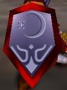
yes I do know that but what does that have to do with anythingI like the old one better, more mystical and enchanting to me. Like truly drowning yourself in a mirror.
You know they also changed the blood from when Link slashes Ganon's face three times from red to green.
 ;)")
I read somewhere that the changes made to OoT were not only to its GC version, but later N64 cartridges. So those who have the earlier OoT cartridges have a piece of videogame history in their hands. Now, to the changes. I believe its not only the symbol (I prefer the old one better), but also the music from the Fire temple (something to do with it being similar to an islamic song or something, so they decided to change it). The most absurd change IMO, is ganon's blood going from red in the original version to green in the new one. I mean c'mon, we're not in the snes days when they would remove blood from Mortal Kombat. Even Mortal Kombat II has blood!!1..and lots of it btw. So ganon bleeding red for like...3 seconds is wrong??....ridiculous
about the new logo (gc version) after i saw it looked really familiar but i could not figure out why. its as if i seen that logo before somewhere. if somebody knows that please tell me.