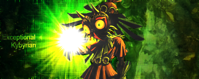
• Welcome to ZD Forums! You must create an account and log in to see and participate in the Shoutbox chat on this main index page.

Zelda Art Voting: GCC Week 11 - Majora's Mask Signatures

Who's is better

  • Kybyrian

    Votes: 0 0.0%
  • Steve

    Votes: 0 0.0%
  • Josie

    Votes: 0 0.0%
  • Zelda's Child

    Votes: 0 0.0%
  • Xinnamin

    Votes: 0 0.0%
  • TheGreen

    Votes: 0 0.0%

  • Total voters
    0
  • Poll closed .
Joined
Sep 16, 2009
Location
Cali For Nuh
So I will be giving out donations later this week for those who participated in last week's competition. (Both by submitting entries and by giving a detailed critique). So be prepared for a little surprise if you have done so...

Moving on wards. To celebrated week 2-3 of Majora's Mask Month, A few of our fabulous artists have created Signatures. Please give them a critique and vote for which one you think should win.

Voting ends in 4 days... Good Luck!

Kybyrian
MajorasMask.png


Steve
MMLink.png


Josie
14dhy04.png


Zelda's Child
attachment.php


Xinnamin
Keaton2small-1.png


TheGreen
MajorasMaskSig.png


So be sure to vote and leave your critique so that these artist may know what to work on!

~~~~~~~~~~~~

Week 12 - GCC

Theme: Majora's Mask (Final Week)

Medium: Avatars

Due: Saturday November 13, 2010 @11:59PM PST
(-8:00GMT)

PM your Entries to ME, Baysiderulez

~~~~~~~~~~~
 

Xinnamin

Mrs. Austin
Joined
Dec 6, 2009
Location
clustercereal
Kybyrian: Awesome lighting effects, the colors go together really well too. The little text on the left made me laugh XP It's just a shame that the shading on the render doesn't match the light source, but that's not something you can control. Lovely texture though.

Steve: Love the colors, and something about how subdued the colors are really appeals to me. I also love how the word LINK is written above the shield like that. It blends in pretty well without detracting from the piece as a whole, which I'm guessing was your intended effect.

Josie: It's cute, and I love how it says Majora's Mask Month as a nod to our site project. However, the color of the text doesn't match too well with the color/design, making it a bit hard to read. One way to fix that is to just to have another color under the text as a sort of buffer. Also, the render for Deku Link's flower is a bit cut off, barely noticeable but still. Love the background design though.

Zelda's Child: Simple and adorable, I love the concept. The render is a bit blurry, though that's not your fault. However, the text is kind of blurry too, and perhaps a bit too small given all the space there is. Also, that sparkle at the bottom by Anju's dress would have probably looked better if it was over her dress instead of under, because right now it just looks kind of cut off. Nice job though keeping the text legible despite it having similar colors with the background.

TheGreen: I LOVE the concept. Blurry renders aside, the position and execution works wonderfully. Though the images flow really well, the text is a bit...out of place. It just doesn't flow very well with its bright contrasting white. At the same time the effect is pretty interesting. I think you forgot to remove the white bg though, since the top of the image isn't transparent.

I'm a sucker for well executed colors, so I'mma vote for Steve.
 
Last edited:

Anubis

The most inactive active
Joined
Nov 21, 2009
Location
Gothenburg, Sweden
Kybyrian VS Steve...Im gonna choose Steve's becuz I dont understand how he makes it look so good! XD Its a simple banner but it still looks so awesome! Wish that I one day will be able to do his awesome effects. :) All of them are epic but my vote goes for Steves banner.
 

Steve

5/19/13
Joined
Aug 25, 2008
Location
Florida
Kybyrian
The first flaw is the lighting, in that where you have placed the source, it does not match up with the stock you have chosen. One of the important things when making a signature, is that it is coherent. Looking at your render, the light source was clearly intended to be placed above, and to the right of Skull Kid, but instead you have placed it centered, and to the left. The other problem with this lighting, is how bright it is. My eye is instantly drawn to it, making it the focal point for this banner, which should not be the case.

Also distracting is the text, which causes my eye to move from your light source to it, rather than your stock. When adding text, it should not simply be placed in, but instead must physically and mentally add to the piece. The reason I placed my text the way it is, is because not only did it to the flow, but the large area of black it is covering was distracting from the focal.

As I just mentioned, flow is also important. One way or another, the other aspects of the sig should not only add to, but lead to your focal. This is very important when making sigantures, and is something many sig makers often neglect. Flow need not be always noticeable, like it is in my signature, but the construction should in some way, come back to your focal point.

Finally, while it is crucial that you make your stock stand out from the background, and other parts of your signature, it must also blend, for even the background still adds to your focal. Everything in the sig should be in unison, and so the contrast between stock, or background, or text should not be instantly apparent. Whether it is through effects, brushing, or smudging, the transition from background to focal must be a smooth one.


Josie
The first thing I will go into for you is the stocks. While it is certainly possible to make a good signature with multiple stocks, placing them on opposite ends will prevent this. Your eyes get confused as to where to go, and thus you basically have no focal. The quality of the stock is also important, because even though your Deku Link appears to be just fine, your Skull Kid is pretty low in quality. I did notice, however, the Deku Link gets cut off on the end, which brings me to my next point.

Pop-out signatures are a wide spread technique, and in some cases, can work out really well. One of the problems you have is that you have essentially pasted the renders on there, without giving much thought as to how they will blend with the background, and so you have stacked images. I’ll use Xinn’s as an example, because she has a pretty good example of it works. While she uses this pop-out technique, she still keeps it within the confines of her canvas, so it is still a part of the signature.

Color is an important element as well. One of the things I did like about Kybyrian’s signature was that the green he chose really complemented his render, and helped blend it slightly. What you have chosen is a really bright magenta, and a light blue for your text, which not only contrast each other, but do not compliment your stocks at all. The white brushing in the background also adds nothing to the signature either, except filling up empty background space. While this isn’t necessarily a bad thing, if it isn’t doing anything for the signature, there’s really no need for it.

As I also told Kybyrian, text should add to the work. Your text is acting like a focal in this case, because you have it placed in the middle of two stocks, have used a really contrasting color, and it takes up a lot of space. For whatever reason, and I have no idea why, your text looks really blurry and low quality.


Zelda’s Child
I compliment you for using a bit of flow in there, but the problem you have is it’s not really going in the right direction. In the render you’ve chosen, Kafei is leaning in. His direction is going the opposite direction of what you have used. The thing about flow is much like lighting, in that it must cooperate with the stock.

It’s always good to use effects, but the purpose that they serve, is they are adding into the flow, and are also not distracting. In your case these brushes are bright, in fact the brightest aspects of your sig, and so they really grab most of the attention. In addition, they are randomly scattered throughout, instead of contributing to the flow.

Your render is kind of low quality, but is also placed in, without any blending. Furthermore, it’s a pretty emotional scene, so I think giving your signature such a mood would really bring it to life. Other than that, your text blends pretty well, but it doesn’t really add anything, and is just sort of there.


Xinnamin
This one kind of hurts me because I imagine quite a bit of work was put into the artwork you made, and I think it’s a really good stock. The problem is my decision is based on the signature itself. I think it’s great that you incorporate your art into your work, but I think if you do so, it should be present within the entire piece.

The background you’ve chosen is just a pasted screenshot, with a green color that does not compliment very well. Furthermore, I think you had a really good opportunity to add flow with your stock, because of the tails, which could really help with this. You have also used far too much text, which takes up the majority of the space, and really adds nothing whatsoever. It seems like you simply used the text to make up for the lack of anything else.


TheGreen
The issue here is the same as Josie’s, because you have used multiple renders, you thus have no centerpiece. You’ve made the child standout amongst the others through opacity and size (it is good to emphasize), but my eye is still drawn away from it because of the other stocks used. The problem you have, much like with the other signatures, is that you have merely pasted the render in, without allowing it to blend, and simply have pasted image on pasted image.

Also the same is that your text distracts and does not help the signature in any way. Overall, I can’t comment on anything else because you haven’t really done anything but placed in renders and text on a plain background. I will say, though, I liked your use of size to add flow leading to the stock.
 

February Eve

ZD District Attorney
Joined
Mar 21, 2010
Location
USA
Enter the nontechnical perspective again.

Kybyrian: It's an interesting sig. I keep staring at the right side and trying to decide if there's supposed to be something there or if I'm just making it out to be a Rorschach test when it isn't. I think that's a consequence of the different textures, but I like the overall idea.

Steve: I quite like the sig, colors, and execution of it. Also, despite my lack of technical knowledge, I feel I can see some of the ways you manipulated it. Though I'm not entirely sure what's going on in it. (Eta: It reminds me of manga representations of attacks, but I'm not sure if that was the intent.)

Josie: I like that you used both Link and Skull Kid in your sig, and I think it was a nice choice of background color (it seems to match several colors in the renders.) As others have said, the text color doesn't quite work (and as a personal preference, I'd like it centered, though aligned left, at least the M's match up.)

Zelda's Child: A good concept, and I like that the hearts don't jump out at you but are still noticeable in the background. I know it's probably hard to find really sharp graphics, but my main concern is that your focal image is blurry. Anyway, again, love the characters you chose for it.

Xinnamin: I like the text for this, probably because its a direct quote from the game and so it works better than some others have for me. I really love the Keaton design, too. Ultimately I voted for yours. For some reason it seems to be a little off-balanced, though, with the right side having less going on than the left.

TheGreen: Really like the concept, but focal image is again a bit blurrier. How would it have worked had you reversed it so that it went from child to Majora's Wrath as the main image instead?

As always, applause to all of you for getting out there and honing your skills. :)
 
Last edited:

David

But you called me here...
Joined
Aug 6, 2010
Kybyrian: I really like the concept of this piece. It adds some really cool effects to a relatively simple render. The biggest issue that needs to be fixed is the lighting. As others have said, the shadows on the image show that the lighting source needs to be on the other side of the image. I'm pretty sure that if you spent the time, you could have used either Burn/Dodge techniques or even manipulating brightness and contrast adjustment layers by selecting the dark areas and making them lighter and selecting the light areas and making them darker. Just a suggestion, but It could work. All in all, its really really cool and I like it a lot.

Steve: I really like your entry as well. I really like the colors you used in the splashey smudgey thingy around Link's arms. I just think that the background color could have been darker to be easier on the eyes. Actually, I would prefer that the entire image was darker, but that's just me. And it took me about 5 minutes to find the word Link hidden in the image. Very well done.

Josie: Well, its not my favorite, but its not bad either. I think that you could have used some different techniques to make the background flow more with what's happening in your renders. In my opinion, your background seems a little random for the images that you chose. The color compliments Skull Kid, but it only compliments a tiny bit of the Deku. And there is a noticeable difference in clarity in the two images that you chose. And I know that its hard to get multiple renders to work in art, but you did a pretty good job. The Deku is much sharper than Skull Kid. That really needs to be addressed when you are using multiple renders. Oh and when you place your renders, make sure that if you are incorporating the entire image, don't let anything get cut out (the flower in the Deku's hand is a little cut off) And finally, my other criticism is your text. It seems a little random to me. I like the font, but a different font could have expressed what you were going for in the image. The color is completely contrasting the background making it hard on the eyes. A good technique is to either use a clipping mask with your text outlined, or to make the text a lighter or darker shade than your background. Good job though and congratulations on submitting something for us all to see! I know that with some practice, you'll get even better.

Zelda's_Child: Very sweet moment for us all in Majora's Mask. I really like the ideas that you must have had when you were creating this. My advice is to fill up the space that you gave yourself in the image. A small render can be effective if you have some cool effects complimenting it and taking up some of the extra space. Another thing is that the image could be sharper. The render is very blury and makes it harder to make out what is really going on. Very good job to you as well. I'm looking forward to seeing you get better and better.

Xinnamin: I really like this one. The Keaton is very well drawn and totally captures the character that I remember from the game. Playful, yet serious. The quote is a nice touch too. Its one of my favorite quotes from the game. My advice is that the text seems to be taking my attention from the Keaton. It's creating a little confusion in my mind on what I should focus on. When using text, it should compliment the image in its entirety. This includes the background and the render. Try not to use huge and dominating text, unless of course, it is the sole focus of the art. Very well done to you too. I really liked it.

TheGreen: This one is very well done too. I like how it shows the evolutions of Majora. I also like how they fade out as they progress. They are actually pretty good quality for being directly from the game. My advice is that you should try and center the attention more on the child. The others in the background are cool and are nice in the art, but they kinda take away from your main focus. I think that a good way to prevent this would be to add some flow to the art. Show some flow that transfers to each of Majora's forms progressively. Maybe some cool C4D effects or some really cool brushes with different blending properties. Or another thing that you could have done is to just show the child with the final stage faded in the background. These are only my opinions, so you don't have to take any of them.


Please remember that most of these are my opinions and may not apply to every single piece of art. They are only things that I noticed and I gave suggestions on how to fix it. And all of the suggestions on how to fix it are opinions, not "You-have-to-do-it-now-and-you-can-only-do-it-this-way" commands. But all-in-all, these are really well done images. I really enjoyed seeing them and give my opinions and criticism. I wish that I knew about the contest sooner, because I would have submitted something as well.
 

Zelda's_Child

~Insert Epicness Here~
Joined
May 15, 2010
Location
Wherever I want to be
Kybyrian: You gawt mah vote. It's sharp, clean, and overall beautiful. I'm blown away.

Steve: Very nice. I really like it, except for the fact that it's kind of faded. I prefer a sharper sig, but that's only me. Also, the bright colours make it good, but are kind of overpowering in a way.

Josie: Nice, but I don't think the colour of the background has anything to do with your renders. They look kind of slapped on... but who am I to be judging? I do it myself!! Also, the text doesn't seem to have anything to do with the rest of the sig. But, you're improving. That's all that counts, young'un. ;)

Zelda's_Child: I hate it. I can see every little mistake you've made. 0/10.
But seriously though, I went on youtube to get a screenshot of the render. The only video that I could get a good render from was very dark. Does anyone have any tips for me? P.S. I currently use GIMP, so please don't go all Photoshoppy on me. Also, I see now that my text has managed to nicely make itself all yucky. :( The sig looked empty, so I added the sparkles. Now I see that they're too overpowering. :(
I appreciate all your help, though guys!! ^^

Xinnamin: I really like it, but it didn't really catch my eye. Now I look at it, I'm not sure why, because it really is brilliant. I've probably been hypnotised with sparkly people... >.<

TheGreen: I actually think that you've used the mask a bit too much. It has too many renders. Also, the render at the front is a very different colour to the rest of the sig, which makes it unappealing. I'd suggest either not using that render, or giving the sig a different colour scheme altogether.

Overall, they were all really great entries!! Except for yours, Zelda's_Child... :xd:
 

Kybyrian

Joined
Jan 31, 2008
Location
Amherst, MA
Gender
Didn't I already answer this one?
Kybyrian: I really like the concept of this piece. It adds some really cool effects to a relatively simple render. The biggest issue that needs to be fixed is the lighting. As others have said, the shadows on the image show that the lighting source needs to be on the other side of the image. I'm pretty sure that if you spent the time, you could have used either Burn/Dodge techniques or even manipulating brightness and contrast adjustment layers by selecting the dark areas and making them lighter and selecting the light areas and making them darker. Just a suggestion, but It could work. All in all, its really really cool and I like it a lot.

Definitely something I'll keep in mind. After doing your C4D tutorial it made me realize how much power you can have over your signature using the burn/dodge tools, even though it's not always a huge change, it still helps improve and is noticeable in most situations. Not to mention the sharpen and blur tools...
 

David

But you called me here...
Joined
Aug 6, 2010
Definitely something I'll keep in mind. After doing your C4D tutorial it made me realize how much power you can have over your signature using the burn/dodge tools, even though it's not always a huge change, it still helps improve and is noticeable in most situations. Not to mention the sharpen and blur tools...

yeah. Techniques like those can really, really improve what is happening in your signature. Bluring a little bit of the render that doesn't need focus allows people to automatically focus on the actual focus on the render almost naturally. And darkening the edges add to that too.

And who derepped me for my post with this reasoning? "becose you dont wote ritgh". I'm pretty sure that I "wote ritgh". And I was only giving my opinion on how the artists could have improved there skills overall... I wasn't trying to attack them in any way, shape, or form.
 

TheGreen

is climbin' in yo windows
Joined
Jul 12, 2010
Location
San Antonio
I'd like to publicly apologize for my sig. I think that it's easy to see that the sig itself was put together rather hastily. I believe I held up the thread :embarrassed:

I did spend a lot of time finding a high res video, getting appropriate screen shots (Majora's Incarnation was a b****) and rendering those screen shots and a good amount of time composing the renders, but I spend no more time than picking a nice purple and adding a gradient on the back ground. Admittedly the moon child is pretty awful. It would've been nice to do some original art for it which is a different art style, but still cohesive with the other figures so that it would stand out.

I feel my strong point on this sig was the concept and it was pretty much downhill from there.

Thanks for the commentary everyone, I've taken all your critique into account.
 

OotLord1003

Young Link
Joined
Mar 31, 2010
Location
CA
Geez....I could NOT choose between Steve and Kybyrian....hm...I'm going with Kybyrian. I like lighting effects...
 

Random Person

Just Some Random Person
Joined
Feb 6, 2010
Location
Wig-Or-Log
Wow, hardest one yet. But, a choice must be made.

Ky - Tried to but cannot find anything wrong with yours. The location of the text is up for debate but that's a matter of opinion and I don't think you chose a bad spot.

Steve - I would love to know how you made that. Unfortunately there is no text, and sigs tend to look better with text.

Josie - Way to get in the spirit of Majora's Mask Month. But Link is cut off and it appears as though skull kid is a little too. Plus the location of the characters seem a bit too Random.

Zelda's Child - Beautiful. The only thing that could be a problem is that the text color is a little to similar to the background color.

Xin - Not my Personal favorite but there is nothing wrong with this sig. I find that the text, pic, and background are pretty much perfect.

The Green - The only thing I'm iffy about is your text. It may be too small and in the wrong location. Other than that it's good.

Wound up voting for Ky. ZC was a very close second but out of these if I wanted to choose as my sig, I would choose Ky's.
 
E

Emily

Guest
I think TheGreen's in very cute!

Edit: Sorry, I mean Xinnamin's.
 
Joined
Oct 26, 2008
Location
Brexit
I voted for Steve's, everyone has made good images, but I think Steve's stands out as the best.
 
Last edited by a moderator:

Users who are viewing this thread

Top Bottom