r2d93
Hero of the Stars
- Joined
- Nov 10, 2011
- Location
- Lost Woods

So what do you guys think of the newly revealed box art? Personally I love it. It's very majestic and mysterious looking. And of course the gold is stellar
Last edited:

 :)")
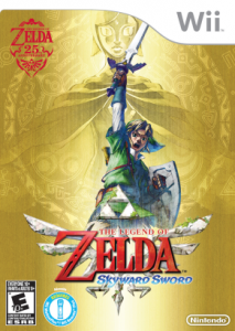
I liked the lost woods background with the Master Sword, it sorta reminds me of the japanese alttp box art, with a random drawing Link on a wall.
I wish it wasn't gold.

I would've liked the background better of I can see the trees and stuff in their original colors, that would give a different atmosphere than if it was gold, it would make the box nicer to look at in general.What's wrong with it being gold? I actually like that it's gold, it gives the box art a nice effect to it.


 ;)")