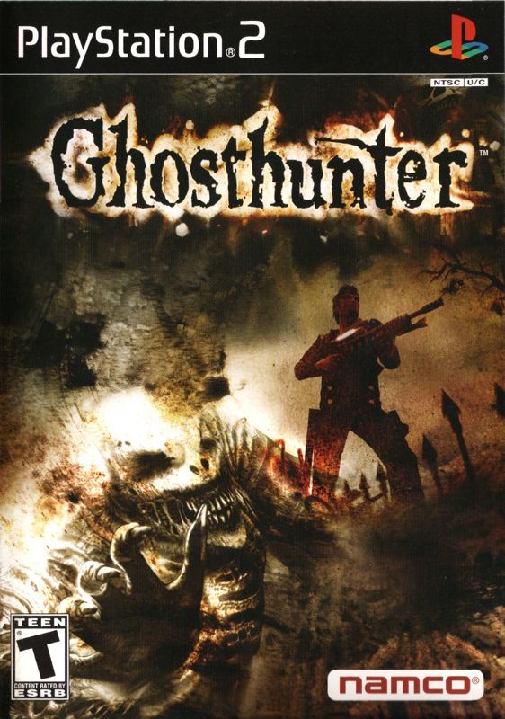

Box arts can make or break a game. For the longest time they were the only way most games could ever stand out. There are some good ones out there, there are some bad ones out there.

And then there are ones that are so notoriously bad that they end up being one of the most memorable things about the game.
So what are some of the worst box arts that you know of? They can be obviously bad, or they could be bad for more subtle reasons.
As much as I love Fortune Street, I always found Fortune Street’s box art to be pretty bad.

In addition to just being so crowded and not particularly balanced, all of the Mario characters (and maybe the Dragon Quest characters too, I wouldn’t know) are all stock images used in awkward ways. For instance:
Why is Mario standing in front of the floor instead of on top of it?
Why is toad sitting on the ground while everyone else is standing?
What is Donkey Kong looking at?
Why is Luigi running perpendicular to the game board?
The box art feels like someone who’s used photoshop twice back in high school had to insert Mario characters in at the last second.
And then there are ones that are so notoriously bad that they end up being one of the most memorable things about the game.
So what are some of the worst box arts that you know of? They can be obviously bad, or they could be bad for more subtle reasons.
As much as I love Fortune Street, I always found Fortune Street’s box art to be pretty bad.
In addition to just being so crowded and not particularly balanced, all of the Mario characters (and maybe the Dragon Quest characters too, I wouldn’t know) are all stock images used in awkward ways. For instance:
Why is Mario standing in front of the floor instead of on top of it?
Why is toad sitting on the ground while everyone else is standing?
What is Donkey Kong looking at?
Why is Luigi running perpendicular to the game board?
The box art feels like someone who’s used photoshop twice back in high school had to insert Mario characters in at the last second.