• Welcome to ZD Forums! You must create an account and log in to see and participate in the Shoutbox chat on this main index page.

WW-Wii U The Wind Waker HD's Bloom Gets Dialed Back

JuicieJ

SHOW ME YA MOVES!
Joined
Jan 10, 2011
Location
On the midnight Spirit Train going anywhere
Some new screenshots for The Wind Waker HD have emerged, and they show that the intense bloom effect that I and many others have complained about has been reduced. Take a look.

tww-hd-less-bloom-1.jpg

tww-hd-less-bloom.jpg

tww-hd-less-bloom-3.jpg


I'm very happy this has been done. While the cel-shading is still absent, it's no longer an eyesore for me to look at images and videos of this game, so it's something.
 
Joined
Aug 10, 2013
Location
City of Angels
Oh, thank God. The original screenshots had a ridiculous amount of bloom. Imagine playing with everything glaring in your eyes. My eyes would bleed. I'm just glad Nintendo is actually hearing out the fans and tinkering the game so it looks at its best!
 

Ventus

Mad haters lmao
Joined
May 26, 2010
Location
Akkala
Gender
Hylian Champion
It still looks like The Clay Waker rather than The Wind Waker, but that's alright. Nintendo loves their Bloom, tho.
 

ProtagonistJake

Shepard
Joined
Jun 26, 2013
It still looks like The Clay Waker rather than The Wind Waker, but that's alright. Nintendo loves their Bloom, tho.
I dunno, still looks like Cell-shading to me, just not as much. Which is a shame, but I guess this allows the more detailed textures to be seen or something, so they toned it down a bit.

I don't like the decision, but I at least understand it.

In fact, now that the over-blown amount of bloom is finally bloody toned down, I'd say I probably over-all like the way it looks more the original (for the most part anyway).
Looks damn good.
 

Big Octo

=^)
Joined
Jul 2, 2011
Location
The
I really appreciate the change. The bloom intensity they had before was a real eyesoar, and I couldn't imagine playing through the whole game with that amount of brightness burning my retinas. I don't mind the lack of cel-shading, the graphics still look great to me.
 

Mido

Version 1
Joined
Apr 6, 2011
Location
The Turnabout
Whoa, I can definitely tell the difference without the bloom. I have to say, it looks much better. The graphics look a bit more polished, and the cel-shaded style kind of re-emerges, in the respect that, at least through my vision, the color is much more vivid without the bloom. It's definitely less dull, and that's always a plus!
 

Krazy4Krash

Moderator
Staff member
Moderator
Joined
Jun 15, 2010
Location
'straya
This looks so much better. The heavy use of bloom was my only problem with the graphical aspect, and to have less of it is a marvelous change.
 

Ventus

Mad haters lmao
Joined
May 26, 2010
Location
Akkala
Gender
Hylian Champion
For better comparison,
WiiU_ZeldaWW_scrn01_E3.jpg
tww-hd-less-bloom-1.jpg

Some shadows seemt o have been improved as well. Either way, theg ame looks great...just not better than TWWSD as it's a different style altogether.
 

JuicieJ

SHOW ME YA MOVES!
Joined
Jan 10, 2011
Location
On the midnight Spirit Train going anywhere
Certain screenshots have the APPEARANCE of the original TWW due to Nintendo having added in the its lighting to the enhanced port remake. Multiple others, however, show off the plastic shading style due to the lighting effects from the initial screenshots coming to the forefront -- which shows Nintendo's lazy and amateurish approach to "changing" the visuals, since all they did was add lighting to an already existing lighting and slap on a bloom effect (which has now been reduced). For example:

WiiU_ZeldaWW_scrn02_E3-640x360.png
Does that look anything like cel-shading? For comparison's sake, here's a similar shot from the original game:

011.jpg
Both of these images showcase a flash effect from an enemy strike, which causes a brief moment of brightness. The original game's visuals never appear to look different during this, unlike the remake's. If that's not proof of what I'm saying, I don't know what is.
 

Ventus

Mad haters lmao
Joined
May 26, 2010
Location
Akkala
Gender
Hylian Champion
Both of these images showcase a flash effect from an enemy strike, which causes a brief moment of brightness. The original game's visuals never appear to look different during this, unlike the remake's. If that's not proof of what I'm saying, I don't know what is.

Yeah, I see what you're saying and I agree. For that reason, I say that TWWHD's art style ISN'T better than TWWSD's, again because it's different and not necessarily an "upgrade". TWWHD looks great don't get me wrong. ;p

On the subject of TWWHD, you called it an "enhanced port" when really it's a "stripped HD port with a different art style" ;p
 
Joined
Jul 1, 2013
It actually looks more colorful and vibrant without the intense lighting, which is a little ironic I think. The fact that it's plastic-shaded in a lot of cases does bother me a bit, but I haven't had a working copy of Wind Waker in years, so I will be getting the remake. At some point.
 

ProtagonistJake

Shepard
Joined
Jun 26, 2013
"stripped HD port with a different art style" ;p
Wait wut

What was stripped exactly? It's the same except with all of the little issues with the original, except the Ocean itself not having enough significant content (but even then is now easier to ignore cause of Super Sail, but still fixing that wouldve been nice), with the only thing that was replaced being the tingle tuner, which was... Well... Kinda stupid...
I mean, it was neat for getting some quick cash for the dumb triforce hunt (which how they fixed that in this remake is brilliant), and to get those dumb Tingle statues for his island but... Thats it. Not a huge loss is all.

The new art style is arguably not as good as the original, but overall, the game is simply an improvement.
 
I have to say even with the bloom effect, it's still toon-shaded. I think some of you are mistaking the actual graphical style of The Wind Waker with the absolute definition of toon-shading. That's not the case. While the game adopted this unique shading technique, the coloring style is not part of it. While I am fonder of the graphics style in the original than the HD version, both are equally toon-shaded. Allow me to explain...

Shading in most [semi-]realistic art styles sports a smooth gradient overlaying the subject. Sort of like this:
43a6J.png


Toon-shading is essentially the distinct separation of those values so that it gives off a cartoony look. The representation of the above gradient could be something like this:
43aeH.png


In The Wind Waker's case, only two or three values are displayed at a time, creating a rather vectored shading style (In Phantom Hourglass and Spirit Tracks, five or six values are usually displayed making it less "crisp" but still a part of toon-shading). There is a light side and dark side of any figure at any given time, staying constant by the light source. This shading technique is exactly--and I mean 
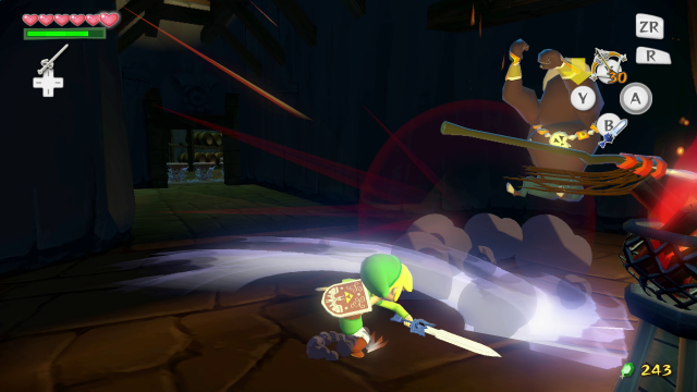
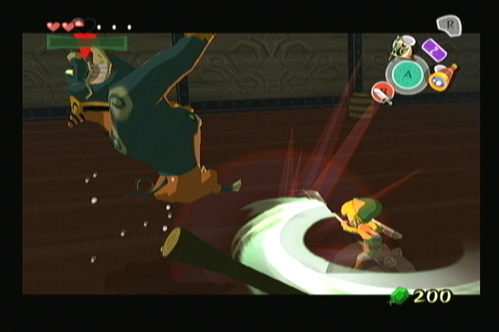
exactly--the ame in the new HD version of the game. The difference that is being noticed is the semi-blurred overlay that is being referred to as "bloom" but is totally unaffected by the shading. That is a coloring difference. The original sported a flat-color graphics style where this new one subtly dulls the boundaries of each model. Without the toon-shading, the HD game models probably look fairly similar to the Toon Link models seen in Garry's Mod. Clay-ish, sure, but you cannot complain about the WWHD not being toon-shaded. Because it is.

Besides, what you guys are calling "bloom" appeared in the original in the Nintendo Gallery as all the figurines which were probably even less toon-shaded than the HD game. Just pointing that out.


This picture is a perfect example.
1150834_10152091298053294_1904689116_n.png


The edges are softened greatly. But the light source is the item being obtained so you cannot see the shading at all.
 

JuicieJ

SHOW ME YA MOVES!
Joined
Jan 10, 2011
Location
On the midnight Spirit Train going anywhere
Except cel-shading doesn't result in a clay look. And, again, the game only has the appearance of cel-shading due to the additional lighting effect, which is dispelled in certain scenarios. I'm sorry, mandy, but it's the same art style we saw back all those months ago with some minor changes.
 
Last edited:

Users who are viewing this thread

Top Bottom