Thoughts on the Latest Ocarina of Time 3D Videos
Posted on June 01 2011 by Nathanial Rumphol-Janc
Before I get into the news on Ocarina of Time, some breaking news on Project Café. We recently posted that it was rumored the codename Café had been abandoned. In fact, this has just been a big misunderstanding. It was never called Project Café – it was called Project Kafei.
Okay, so it’s just a joke. Thanks goes to Ethan Perea for that one on Facebook. Now to get down to business, inside you’ll find some of my thoughts, comments and impressions on the recent Japanese Ocarina of Time 3D videos. Don’t expect an Alex Plant commentary, just notable stuff that stands out to me.
- Din in the Hyrule creation scene is more of a yellow-orange color, instead of the original purple. I don’t know why she isn’t just red, but this new version is a step closer.
- The Triforce looks a lot like it does united in The Wind Waker. Looks to utilize the 3D effect well.
- Things like climbing vines, water and the whole environment look – as we’ve been saying for ages – absolutely stunning and so detailed.
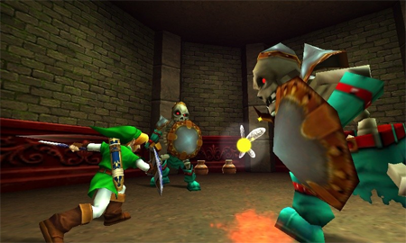
- Facial animations are improved greatly, and better convey emotions.
- Link’s sword charged up for the spin attack has a new, cooler look.
- I can’t say I’m a fan of the new looking switches, chests and even doors – but that’s a minor gripe that just comes from it being different. Shouldn’t take long to get used to.
- When assigning items to buttons when the game is paused, the item is displayed on the top screen, rotating in 3D, which looks nice.
- Items, when seen on the touchscreen, have more of an “official art” look, rather than in-game animated looks.
- Child Link seems taller, or at least has a much more erect posture – because that matters.
- Goddam Link you have some massive feet.
- The tentacles inside Jabu Jabu now have spikes on their tips, and even more obvious weak spots.
- The hookshot has a “sniper-rifle-laser-like” aim. I’ve noticed in recent playthoughs of the original that aiming, especially with the boomerang, seems very dated compared to The Wind Waker and Twilight Princess, so this release should fix that.
- We see Link crawling into the mouth of a Sheikah Stone, which has a really creepy smile.
- Link pushing blocks looks much more realistic because he gets his hip and shoulder into it.
- The video shows a nice look at how a vision works – showing some brief snippets of what you have to do. I must say this looks like the best in-game help system ever.
- There’s some first-time footage, like in the Fire Temple and with Bongo Bongo – all looking fantastic.
- The trailer has both the original music and some orchestrated – not sure what that’s signifying for the game exactly.
- I love how Master Quest is introduced with Ganondorf’s music – alluding to its difficulty.
- Master Quest looks extremely wrong mirrored. Right handed Link is weird in itself (Twilight Princess on Wii was wrong to me for that reason, and it is something that irritates me when I see Skyward Sword), but the real issue is with things like Link’s Kokiri shield emblem being the wrong way. It isn’t right!
- Lastly, the gyroscope is cool. Despite criticisms of not working with the 3D, it really does feel like the environment should actually be there behind the screen.
This game just can’t come quick enough. I’m already falling in love, all over again. At least this time around I’ll have more restraint than that eight year old who didn’t stop drawing Triforces, bows and Master Swords all over his school books. I’m also interested to see for how much longer I’ll be able to search Google Images for “Ocarina of Time” and still get original screenshots. The overrun of the 3D revolution will soon be here, but not soon enough!
