Link’s Awakening Reimagined
Posted on January 01 2014 by ralphpotato
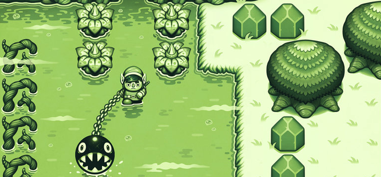 What if Link’s Awakening was designed with a more modern art style in mind? Well Jonatan Iversen-Ejve actually illustrated what he thought. In a franchise where art styles have changed dramatically from game to game, I’d say I’d be willing to welcome what he crafted.
Hit the jump to see!
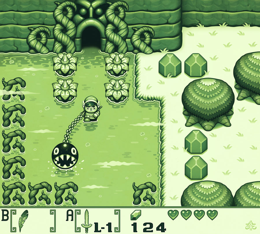
This was originally made for the Swedish magazine LEVEL, but since then it’s landed on a few other websites. It’s a pretty faithful drawing of the Link’s Awakening scene, even the green of the original Game Boy. In fact, Jonatan addressed that and another frequent questions on his deviantART page:
Q. Why does Link look so weird? It doesn’t look like Link at all!A. Isn’t it wonderful? It’s much more fun to draw characters like Nintendo never would make them. Since I’m not, you know, actually remaking this game.Q. Why is it still green? There was a color remake for GBC you know. This should have color too.A. I know there was a remake, but again, it was more fun to draw it this way. I’m not trying to be logical here – I just never played the color version, and for me this is how the game should look.
So what do you think? I doubt Nintendo would remake Link’s Awakening, but I wouldn’t be upset if it looked like this. Let us know in the comments!
Source: deviantART (via Tiny Cartridge)
