Gossip Stone: Does a Zelda Game’s Appearance Affect its Reception?
Posted on January 15 2016 by Alexis S. Anderson
 There are an almost endless number of factors that contribute to the commercial appeal of a videogame– gameplay, functionality, developer, rating– but a game isn’t going to sell if it isn’t pleasing to the eye, at least in some capacity. We can judge by the turbulent behavior following the reveal of Wind Waker’s art style or Skyward Swords’ downgraded graphics that appearance does matter within the Zelda series. So let’s take a look at some of the varied Zelda visual styles and how they affected the games’ initial and later receptions after the jump!
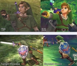 Twilight Princess solidified my devotion to the Zelda series, and I must say I was a little unnerved by the seemingly less advanced graphics that appeared in Skyward Sword. I personally feel that Twilight Princess had the most realistic look to it of all of the Zelda games, so when Skyward Sword shied away from that it rubbed me the wrong way, at first. After having played the game, of course the visuals just become a part of the story and I don’t feel a need to compare them to Twilight Princess’ but in terms of reception, mine of Skyward Sword was not a happy one. From what I’ve seen, a lot of people complained of the downgraded graphics and I feel that it hurt overall satisfaction with the game to a noticeable degree– it’s lucky that the game’s story was so rich or else I fear backlash against it in general would’ve been much worse.
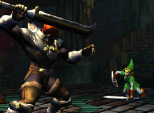 Speaking of a wonderful plot saving an otherwise visually “displeasing” game, when Wind Waker was revealed to the public it was greeted by dissenting cries. The Wind Waker had two tough acts to follow with Ocarina of Time and Majora’s Mask perfectly transitioning Zelda into the world of 3D visuals. And after fans were shown a GameCube concept trailer featuring a battle between adult Link and Ganondorf (in which they appeared very similar to their Ocarina of Time counterparts), the cartoony art style of The Wind Waker came as an absolute shock. People were expecting the GameCube’s capabilities to be tested when it came to the next Zelda’s graphics, and it was assumed that a realistic style would again be pursued. With the previous two console titles being rather serious in content, the cell-shaded toon style was met with even further skepticism. But the game ended up a beloved addition to the series because of its endearing story, among other things, so initial negative reception aside the Zelda community ultimately adored the title.
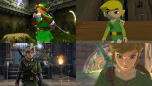
Now, let’s take a quick look at Link’s appearance. The appearance of a protagonist is very important in modern gaming, it would seem; nearly every human protagonist is conventionally attractive, slim, and well groomed (you also can’t tell me there weren’t some gamers who were more inclined to buy Metroid Other M because Samus  looked cute in the cover art). As for Link, devoted Zelda fans likely welcome alterations to his appearance between games, it allows for speculation as to his life or role in society in the game before its release and we’ve seen Link change drastically over the years so it isn’t very shocking. As for casual players, if Link’s appearance changed drastically from one game to the next they may not feel as though they can relate to a new game because it doesn’t match their initial experience. So Link’s looks can throw people off. Even after release games can definitely be written off if the hero on the cover looks strange, but this isn’t usually by people who care very much about playing video games; for instance Link’s older, classic designs are generally ridiculed (though in somewhat of a joking manner), but this can make the quality of the game that design appears in seem hokey and outdated from the get go.
From what I’ve observed (and when taking into account my own opinions), I’d have to say that the visual presentation of a Zelda game has a lot to do with its initial reception, but very little to do with its eventual success or reputation. If screenshots or rendered footage of an upcoming Zelda game is all we’re given, then the visuals are all we have to go off of and they can make or break excitement for a game right from the start. The visuals for Tri Force Heroes informed player that it would be kooky so it was viewed in a lighthearted manner and thus not a let-down once more details of the game were revealed. And of course, Zelda Wii U’s visuals successfully keep Zelda fans guessing and analyzing and just generally swooning over its beauty; it will be interesting to see how the quality of that title lives up to the hype of its visuals.
How big of an influence do you think visuals have on the initial reception and later success of a Zelda game? Are there any Zelda games that you remember having formed opinions about based solely on its graphics? Were your preconceptions affirmed or defied by the actual quality of the game once you played it? Share your thoughts in the comments!
Alexis S. Anderson is a Senior Editor at Zelda Dungeon who joined the writing team in November, 2014. She has a JD from the UCLA School of Law and is pursuing a career in Entertainment and Intellectual Property Law. She grew up in the New Jersey suburbs with her parents, twin brother, and family shih-tzu.
