Daily Debate: Which Zelda Game Logo Looks the Best?
Posted on August 05 2022 by Heather Beard

As a graphic designer I have unfortunately become quite judgmental of fonts, logos, and overall design of a lot of things. I know they say don’t judge a book by its cover, but sometimes it’s hard not to because sometimes one of the first things that we see is a logo or title, and if you haven’t seen a trailer or are going in with no information, reading a logo can often give you your first impression. The Legend of Zelda has had its fair share of always amazing looking logos throughout the years. I’d be hard pressed to say that any of them were bad, but which one looks the best?
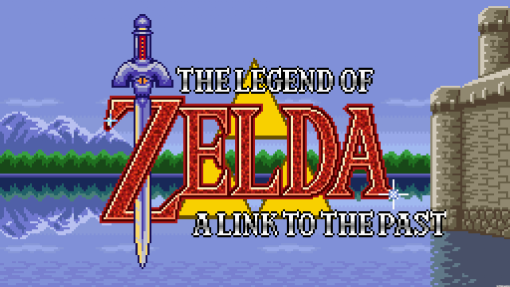
There are a few things that have stayed relatively consistent in each logo, the font of the word “Zelda.” There are some variations, but that ‘Z’ has almost always been styled in that font. So my judgement comes from what is built around that main type and how the rest of the game’s title is styled. To be honest with you I have a really hard time choosing, but maybe the best styled logo would have to be for A Link to the Past.
A Link to the Past also shares its logo elements with the original Link’s Awakening, but we’ll discuss it as it was originally done for A Link to the Past. The logo is just good. Many of the other Zelda logos have the words over another graphical element, but this logo’s text is incorporated into it. The ‘Z’ wraps beautifully around the sword, it all just looks cohesive as it rests upon the shield. Whereas the logo for Twilight Princess is gorgeous in its own rite, but the main text is just thrown over a graphic. (I told you I was judgmental.) The main text is edited, but not in so much as A Link to the Past’s logo though. When comparing the two the Twilight Princess logo is not as dynamic as the other. Though I do really love the font used for the game’s headline.
What do you think though? Which Zelda logo is the best and tell us why you think so in the comments below!

Hi I’m Heather! I’m Senior Editor and Art Director at Zelda Dungeon and I’ve been a member of the ZD team since 2019. I am a graphic designer, artist, and nerdy mom to an awesome little boy. When my nose isn’t in a book, working on my novel or watching anime you can find me curled up with my cats Mandy-Lynn and Daisy Mae.


