Daily Debate: Which Zelda Game Has The Best Art Style and Tone Pairing?
Posted on May 17 2022 by Kora Burton

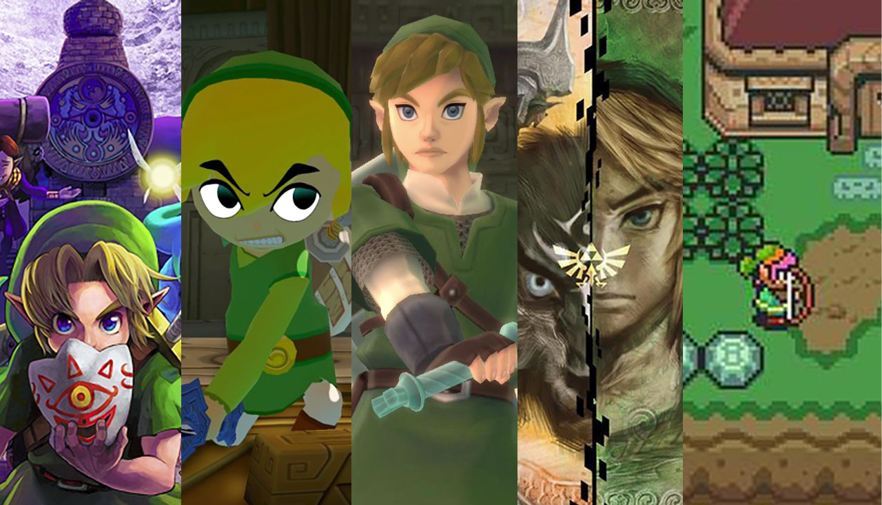
Over the course of the Zelda franchise as a whole, art style and overall tone have gone hand-in-hand. The leap into 3D, beginning with Ocarina of Time and Majora’s Mask, solidified what would become some of the most iconic character designs within the series. They also set the bar for player expectations in terms of storytelling and theme. The era immediately after, beginning with The Wind Waker and continuing with Phantom Hourglass and Spirit Tracks, famously stirred up controversy over its cartoonish cel shaded style and the brighter, more comic tonal shifts that accompanied it. But sometimes art style and tone are more dissonant, striking a strange chord that can be hard to identify.
In response to the reception of The Wind Waker‘s style and tone, Twilight Princess was seemingly meant to mark a 180 degree turn into the gritty and realistic; yet, as much as I do love the game, for its darker art style and narrative, the tone that comes across within the game can often be less serious and much more goofy than expected. Similarly, A Link to the Past presents a light, fun art style, with popping colors and a cuter chibi aesthetic, which makes its darker elements much more jarring.
That being said, opinions can absolutely differ on which games really nail the art style and tone perfectly and which miss the mark. What about you? Which Zelda game has the best art style and tone pairing? How do the elements work together to make something special? Or, what games just don’t quite stick the landing? Let us know down below!

Location: Athens, Georgia, USA
Favorite Zeldas: Breath of the Wild, Twilight Princess, Ocarina of Time
Date Joined: 2022
“Tell me… Do you ever feel a strange sadness as dusk falls?”


