Daily Debate: What Would Have Been A Better Cursor Image For Twilight Princess?
Posted on April 03 2022 by Alexandria Weber

Twilight Princess was the first Zelda game on the Wii, the 2006 dual release marking the end of the gamecube era and the beginning of a new one. Other games during the Wii era experimented greatly with the motion control capabilities of the Wii remote and console, namely Wii Sports and Super Mario Galaxy. Many of these games involved cursors, showing the players where on the screen they were pointing and whether or the not motion controls were working as intended.
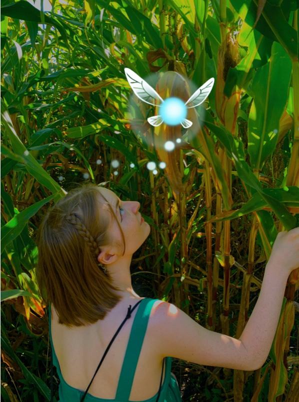
Twilight Princess also had a cursor image, a flying fairy resembling Navi from Ocarina of Time. Although this is likely just another aspect of Twilight Princess heavily celebrating Ocarina of Time, I always thought it was out of place. The inclusion of the fairy has always seemed random to me, and very unlike other aspects of Twilight Princess where inspirations from Ocarina of Time fit wonderfully. The blue fairy was around with no explanation and no connection to the story. So, my question is, what would have been better?
Spirit Tracks in 2009 did not repeat conventions in such a silly way, the stylus merely being a glimmer of light. I feel that this would have been better for Twilight Princess, or maybe even the shape of a triangle, a full Triforce, or the symbol of the royal family.
What do you think? What cursor image would have made more sense? What did you think of the controls in Twilight Princess? Let us know in the comments below!
Alexandria Weber is a Senior Editor and an aspiring creative writer. Her favorite food is apple pie and she loves her cat Galadriel. Ask her for pictures!
