Daily Debate: Do Twilight Princess’ Darker Colors & Realistic Graphics Still Hold Up?
Posted on November 05 2019 by Michaela El-Ters
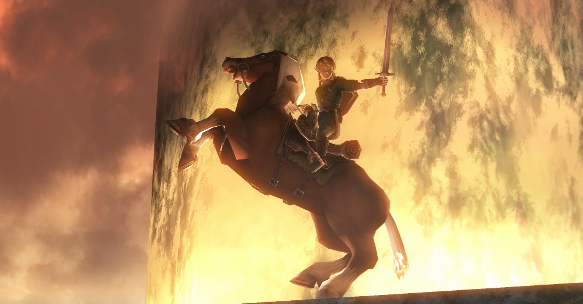
Twilight Princess is a game that is notable for moving away from the brighter graphics and colors seen in its predecessors. In response to criticism about The Wind Waker‘s cartoonish graphics from Western gamers, Nintendo created Twilight Princess with the intention of appeasing those fans and producing a more dark and realistic looking game. On one hand, I can’t blame Nintendo for trying something new, and there were times when the game’s darker, more muted colors conveyed a sense of bleakness to the story. But on the other hand, I wonder if Twilight Princess would have aged better, graphic wise, if the game utilized the cell shading graphics that have been so effective and beautiful in subsequent games.
Generally speaking, I think that while Twilight Princess‘ color scheme may not hold up as well as some other games that came out around the same time, the realistic aesthetic does give the game a distinct look. But with later games like Skyward Sword and Breath of the Wild proving that realism doesn’t have to look dull and gray (and aging much better as a result of the combined cell-shaded graphics and colors), part of me wishes Twilight Princess looked the same. Not that the graphics are bad by any means – they just don’t compare to The Wind Waker, Skyward Sword, or Breath of the Wild, and I think the game and story could have taken advantage of a brighter color palette that could have helped it age a little better. Even Majora’s Mask, despite its apocalyptic storyline and themes, incorporated bright colors and environments to create a contrast that is memorable.
But what do you think? Do you think Twilight Princess‘ color palette holds up? Let us know in the comments!

Michaela El-Ters is a Senior Editor for Zelda Dungeon. She is also an Senior Writer for Boss Rush Network, and writes blogs and streams games on Objection Network. Her favorite Zelda game changes with the seasons, but the series as a whole is near and dear to her heart.
