Art Styles Over the Ages – an Analysis
Posted on June 06 2015 by Mark Olson
 The art style of each Zelda game can turn into a hotly debated topic; while some think that Twilight Princess has a dark and mature visual tone, others see it as dark and drab. I believe that in these debates, the most important aspects of the art are lost, namely how well they mesh with or add to the rest of the game.
In this editorial, I’m going to look at how the series has handled its art direction in the past and, in passing, how I think it should do so in the future. Like art itself, the visual design of games is very subjective. If you disagree, keep in mind…

A Link to the Past was the first game in the series that had a truly well-defined visual style. On the NES, games looked rather similar to one another due to the NES’ limited visual range. The SNES, on the other hand, really allowed game designers to stretch their legs with the art style. Super Metroid looked noticeably different than Yoshi’s Island. Though there is a disconnect between the artwork found in the Hyrule Historia and what we actually saw on the screen in A Link to the Past, the in-game graphics were far closer to realizing the designer’s artistic vision than ever before.
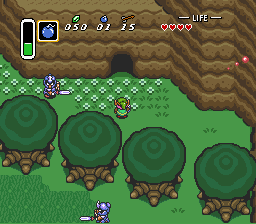
The reason I think that A Link to the Past is a true success artistically, however, is because of its smart use of visuals in communicating the strengths, weaknesses, and capabilities of both standard enemies and the games (for the time, at least) enormous bosses. Perhaps the most obvious example are the possessed Hylian Knights encountered in the overworld. Though exceptionally easy to defeat with a basic grasp of the controls, these knights showcase the sort of intelligent design that I’m talking about, namely through how they’re color-coded. With the hero’s sword, the green knights take one hit while the blue take two. It’s simple, and not entirely unique, but color-coding your enemies goes a long way in making sure that the player understands the game without flat-out explanation.
It can’t be understated how important this is. Though this may seem like a little throw-away detail, when it isn’t in place players can get rather confused before turning to a guide to see what they’re doing wrong. An example of this is in the game Bioshock. Though the game as a whole is exemplary, the base enemies vary in difficulty without any cues, visual or otherwise, notifying the player that they do so. Though my wrench (paired with a tonic, of course) could one-shot any leadhead splicer unfortunate enough to get in my way in the first couple of levels, their HP ramped up afterwards without any change in their character model, leaving me to wonder if there was some sort of bizarre, hidden weapon degradation system that the game wasn’t telling me about.
A Link to the Past, on the other hand, ensured that the player never had any questions regarding the strength of its basic enemies. If they required more hits before keeling over than previously encountered enemies, it either had a different color or a new design entirely. No matter how bad your memory is, the art design is communicative enough that there is no misjudging the relative difficulty of a Keese with that of a Lynel.
When the series transitioned to 3D, a whole new realm of possibilities was opened when it came to visual design. Though Ocarina of Time and Majora’s Mask were severely limited by the hardware they had to work with, these games had a somewhat distinct, anime-inspired look compared to others at the time. I find the decision by the Majora’s Mask development team to reuse nearly all of the assets from Ocarina of Time in their new game to be a matter of interest, even moreso than the the art style itself. Given the Majora’s Mask fervor kicked up by the release of its 3DS remake a couple of months ago, I’m not going to harp on the game, but I will take a bit of time to reiterate the points relevant here.
Any die-hard fan of Majora’s Mask (of which there are many) will tell you that the one, defining thing that makes Majora’s Mask special is its atmosphere. Everything in the game adds up to paint Termina in bizarre, twisted shades, causing a unique and oppressive feeling every time the player decides to fall into the game once more. The art style only adds to this feeling. The choice to reuse models and textures from Ocarina of Time assisted the development team in making the game with relative expediency, yes, but it also helps unsettle the player. Though players may initially see the denizens of Clock Town as familiar faces, the fact that this is not so quickly makes itself apparent. Nothing in Majora’s Mask feels the same as it did in Ocarina of Time, despite the returning character models. The player sees people that Link supposedly saved at the conclusion of his last adventure in even deeper and, some would say, more personal peril. It’s like returning to your old home only to find everything out of place and in a state of disrepair; it’s unsettling, to say the least.

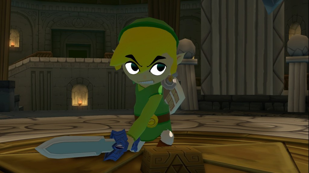
When Zelda fans think of the next 3D entry in the series, the art style is one of the first things that comes to mind. While Ocarina of Time and Majora’s Mask had fans focusing on the gameplay and story, the first trailer for The Wind Waker showed such a radical departure from what fans had previously seen as THE art style for Zelda games that it couldn’t help but for that to be the main focus. The story is, of course, well known; fans whined, the game rocked, and anyone who played it quickly doused their Molotov cocktails in the waters of the Great Sea. It gets said frequently (and deservedly) that The Wind Waker is a gorgeous game. What is heard less, however, is how perfectly the cell-shaded art style fits in with the rest of the game.
The Wind Waker is a light-hearted game; anyone who denies it is mistaking the forest for a few trees, I’m afraid, as though the adventures of the Hero of Winds has its grittier moments…
…it is overall a very happy game. The cartoony art style helps out in ths regard. The soft blue of the ocean, the gentle gusts of wind, the vibrant crimson of the King of Red Lions; all of The Wind Waker’s visual elements help coat the game with thick layers of atmosphere. Even in the games less gleeful locales, the art style helps with atmosphere. The Earth Temple and its Redeads could be considered the only truly scary moment in the game, and as such are the perfect example of the versatility of The Wind Waker’s cell-shaded visuals. The Redeads are very simple, but equally effective. The deathly pallor of their skin coupled with that very skin looking as if it’s about to rip off of their skull is haunting.
In addition to setting the mood of the game, the developers used the colorful art style to great effect in combat. In regular combat, for example, Link’s sword will flash green when he can counterattack a foe. This is a nice touch that ensures attentive players won’t have to stare at the interface to time their button presses properly. This is also something that I could only see working in The Wind Waker– the game’s vibrant and far-from-realistic look ensures that the flashing sword does not feel out-of-place, while it would in all likelihood look bizarre in a game like, say, Twilight Princess.
Finally, I would like to point out how well the simplicity of this particular art style works for communicating things to the player. The cell shaded look of The Wind Waker means that anything more complicated than basic textures sticks out, and as such moments where the player is confused as to what they can and cannot do are few and far between. Whereas games with more complex graphics may leave players befuddled as to their boundaries, The Wind Waker has no such problems. Anything that the player is meant to pick up, shoot, or smack makes itself quickly apparent.
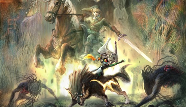
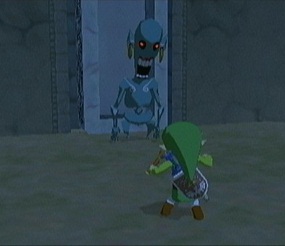
Twilight Princess has, currently, the most divisive art style among the Zelda fanbase. While the initial backlash that The Wind Waker met with quickly transformed into praise, most of the fans’ who gave Twilight Princess’ looks flak upon its initial release have kept their crosshairs pointed squarely at the game. Though I can’t say that I care for the art direction the game took due to a matter of personal taste, I will say that, objectively speaking, the game’s art did its job well most of the time.
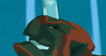
Even though I believe that Twilight Princess suffered from an all-around lack of light sources, I am also forced to admit that this fit the game very well from a thematic standpoint. In regards to story, Twilight Princess is The Wind Waker’s antithesis. While The Wind Waker was generally content to stay within its happy-place, Twilight Princess attempted to push the series boundaries out into more mature directions. The visuals are very similar. The playfulness that the visuals of The Wind Waker exhibited stand in contrast to Twilight Princess with its realistically-proportioned characters and a primarily earthy color palette. Just look at the death animations of basic enemies… While any of the Great Sea’s luckless Bokoblins who happened to draw guard duty as you sail by burst into a puff of bright purple smoke, Twilight Princess’ foes disintegrate into various shades of dark grey accented only by orange sparks.
The Twilight Realm itself has its own unique visual style. Blum effects are in abundance, and the particle effects are very… geometric. Hyrule this is not, and that was certainly the point. The visuals highlight how different the Twilight Realm is from regular Hyrule. As far as second worlds go in Zelda games, the Twilight Realm is as good as it gets on a graphical level.
On a gameplay level, however, I can’t sing Twilight Princess’ praises as easily as I could for that of The Wind Waker. By no means does it impede player progression, but it doesn’t add to it either. Twilight Princess’ gritty and realistic visuals certainly aid the story in creating atmosphere, but it doesn’t help gameplay excepting various boss’ massive, jaundice-ridden eyes.
What I think of Skyward Sword’s art style is the inverse of my opinions on Twilight Princess’. Starting with the story, Skyward Sword’s art design doesn’t inhibit the plot in getting its point across, but it isn’t particularly helpful despite being a joy to look at. I would be in remiss to mention, however, that this could be an unfortunate side effect of Skyward Sword’s tone as a whole being very nebulous and hard to place.
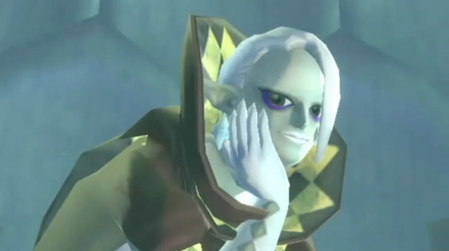
The one section of the story that the visuals really enhanced was Ghirahim as a character. I’ve written before about how awesome Ghirahim is, so I won’t go into too much detail here, but I would like to mention how incredible Ghirahim looks. Like the Twilight Realm, there is a lot of geometry surrounding him, particularly in the neat fire-esque effects utilized in certain cutscenes. Unlike the Twilight Realm, the various rhombuses shown add a splash of color into the scene. Going into my personal thoughts, the visual theming surrounding his character reminded me quite a bit of certain incarnations of the Joker or, in the video game realm, Setzer from Final Fantasy VI. As discussed in my previous article on Ghirahim, the manner in which his costume progressed was fantastic. As cracks began to surface in the character’s psych, so too did cracks appear in his formerly slick and pristine outfit. This a great example of how progression in the visuals can complement progression in the story.
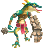
In the gameplay front, Skyward Sword’s art fares better on the whole. In basic combat, each enemy’s weak direction (given how the motion controls were implemented in Skyward Sword I hesitate to call them points) is well highlighted without breaking in consistency from the rest of the enemy’s design. As a quick example, take a look at the Lizalfos below and repress any of those horrible memories you have of fighting them. The Lizalfos’ design clearly shows where they’re vulnerable and where they’re not. Players know that the Goddess Sword can cut through flesh; it cannot cut through stone. As such, when the Lizalfos puts up its guard, the player can use a bit of intuition to quickly decide on an angle from which to swing their sword. In addition, the rock doesn’t look out of place in the Lizalfos’ design. This really aids in smoothing over the occasionally jarring seam between game design and art design. Not only does this concept apply to overworld combat, it also applies to the game’s many dungeons.
The two dungeons found in the Lanayru region are the perfect example of merging art and design. The deservedly popular timeshift stone mechanic found throughout the region and its dungeons wouldn’t have worked half as well if the visuals weren’t there to back it up. The past looks, feels, sounds, and plays distinctively from the future. In the presentation field, the change in color palette really helps to drive the differences home. Whereas in the present day players can practically feel the sand coming out of their Wii remote, the past is sleek and shiny. The dull tan color sweeping over all of Lanayru Desert is swapped out for the lush greens of plant life and the gleaming whites and bright blues of machinery in action. The way these same machines look in their dilapidated form was ingeniously handled as well. These broken mechanical marvels look old and busted, but players can always tell what they did in a past era. Because of this, players are never caught off-guard by a surprise missile launcher upon activating a time shift stone.
This is put to great use upon revisiting the Lanayru region to learn the Thunder Dragon’s portion of the Song of the Hero. Players are forced to work around a perpetually moving time-shift stone, putting nearly all of the skills and items acquired over the course of the game to great use in a mad-dash to get to the next platform or latch on to the next outcropping of vines before they disappear. Because it is easy to tell what something will turn into before it does so, efficient players can play the best route ahead of time. Yet again, this section of gameplay would not have been implemented as well as it was if the art designers hadn’t assisted.
As I hope all of this showed, how pretty a new Zelda game’s art style is shouldn’t be of concern. Sure, a visually appealing direction is great, but gameplay has always come first in the Zelda series and the art style should help in making the gameplay as fun and intuitive as possible. With the increased focus on story that has become a trend in recent years, the tone of games has become of greater importance as well. As Twilight Princess and The Wind Waker showed, the art style can help in an obvious manner here as well. If you take away anything from this entire article, I hope that it is this: the art style shouldn’t necessarily conform to the fanbase’s taste. Instead, it should conform to the type of game the development team wants to make.
What do you guys think? Are you irritated at the lack of my signature poorly photo-shopped images? No matter your thoughts, let me know in the comments below.
